UI Overhaul
Our most major task of the last month was undoubtedly the user interface upgrade. Generally websites related to stock trading have extremely ugly interfaces. So our intention was to implement a design that we felt was more fresh and appealing to a younger generation. This was applied to all pages across our website, but you can see a before and after snapshot of our homepage below.
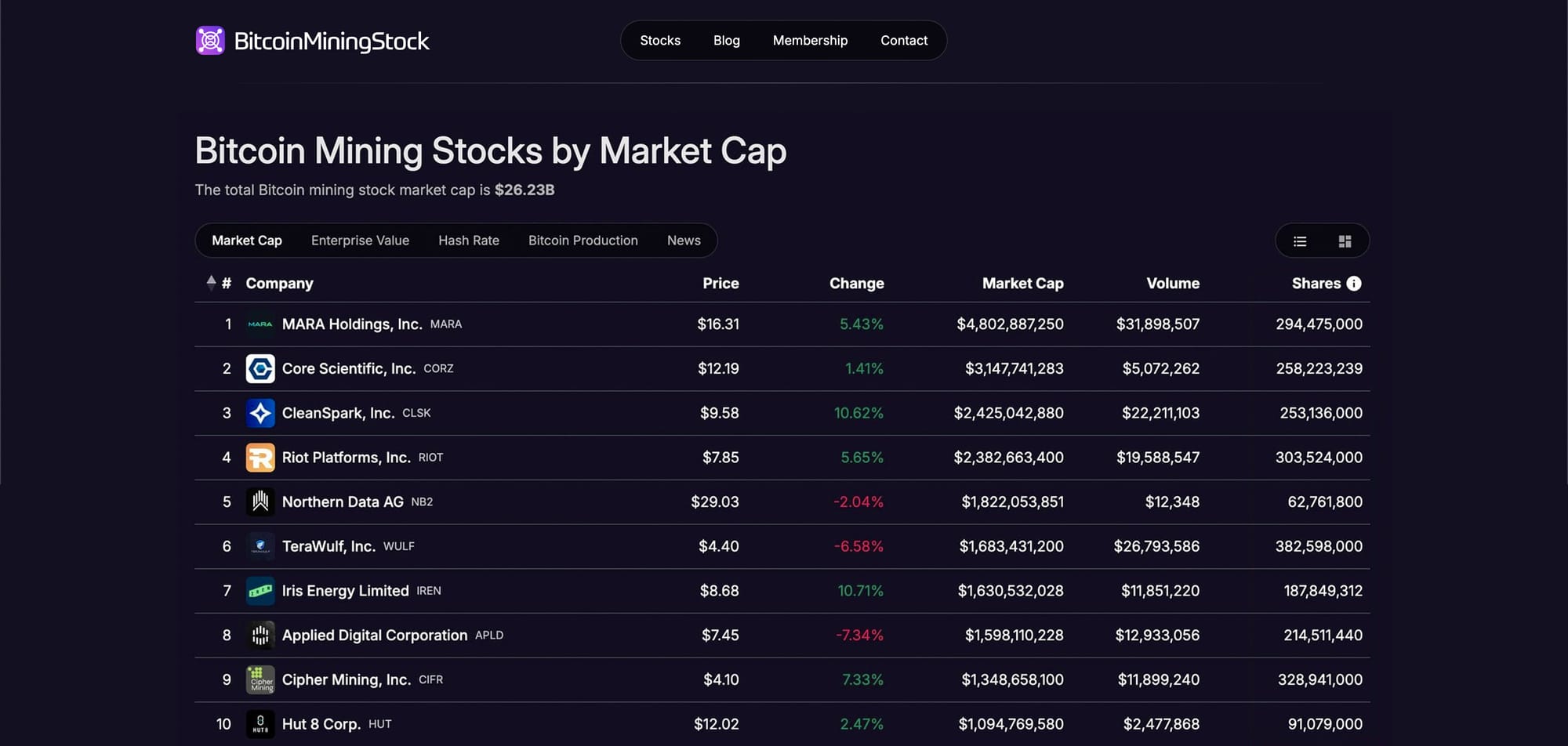
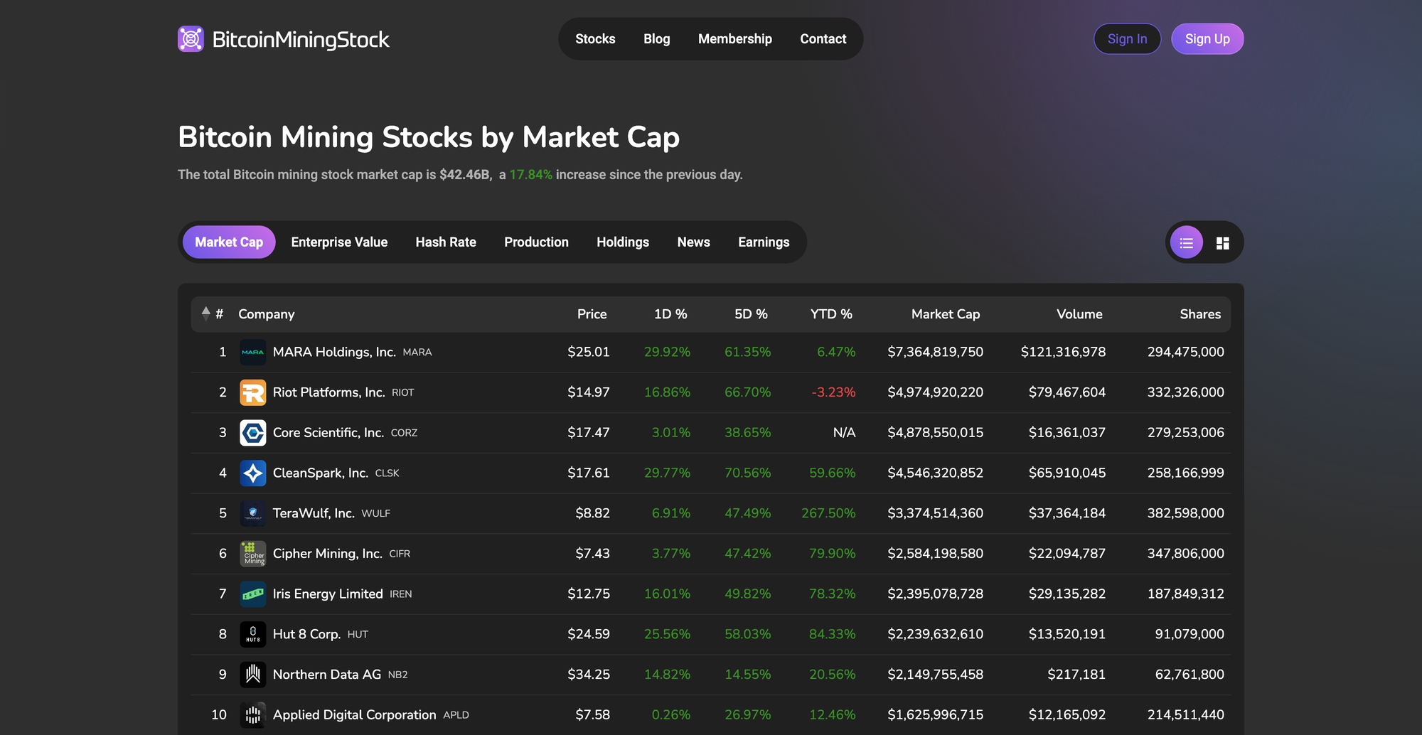
Some of the visual improvements are less noticeable than others, but they do greatly benefit the overall user experience on the website. One such improvement was the addition of placeholders in areas where content needs to load in, such as the rows of tables, which prevents the page from "jumping" when the content appears.
Higher Time-Frame Percentage Change and Total Market Cap Percentage Change
You may have noticed in the above screenshot the addition of the 5D % and YTD % change columns on the market cap table. The intention of this is to give users a better overview of the stock's weekly and year to date performance, while being able to compare that with other stocks. More timeframes will be added later and users will be able to toggle them on or off according to their preferences.

For those of you interested in tracking the performance of the entire sector, we added the total market cap daily percentage change value to the top of this page. Further improvements will be coming here later, where you can view the total market cap performance over longer time periods.

Earnings Calendar
One issue I ran into when first diving into the Bitcoin mining stocks was how could I keep track of all the companies earnings results? From that, the Earnings Calendar was born. With this you can see the upcoming earnings call dates, as well as analyst's expected revenue and revenue per share.
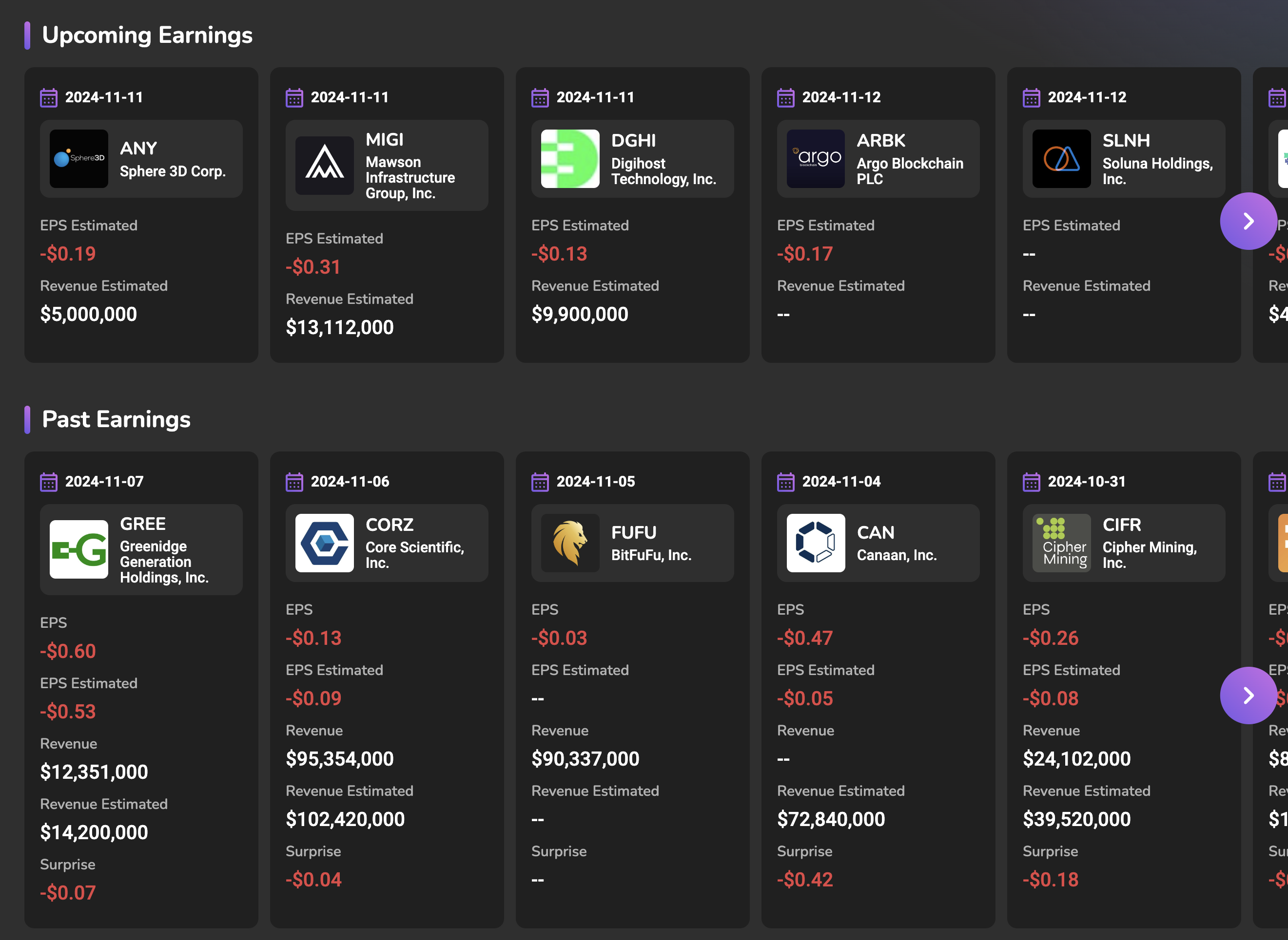
For earnings calls that have passed, we update the company's information card with the actual revenue and earnings per share, where the 'surprise' value is the difference between the two. Additional exciting features are coming to this page in the near future, so make sure you bookmark it! If you want a hint, it has something to do with the next feature I'm about to cover.
AI Press Release Summaries
The addition of the company press release feed was well received by our users when we launched it. In saying that, I felt that the default article excerpts sucked. They were usually repetitive and lacked any information about the actual press release content. I'm pleased to announce this has now been replaced by an AI summary, courtesy of ChatGPT.
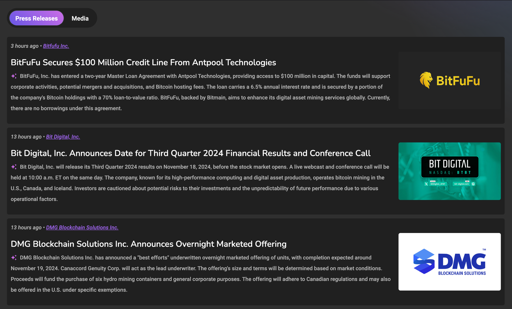
These summaries now give you all the key details of the announcement in a short form factor. So if you're in a hurry, or would prefer to not have to read the whole press release, you can rely on the description alone for the most important information.
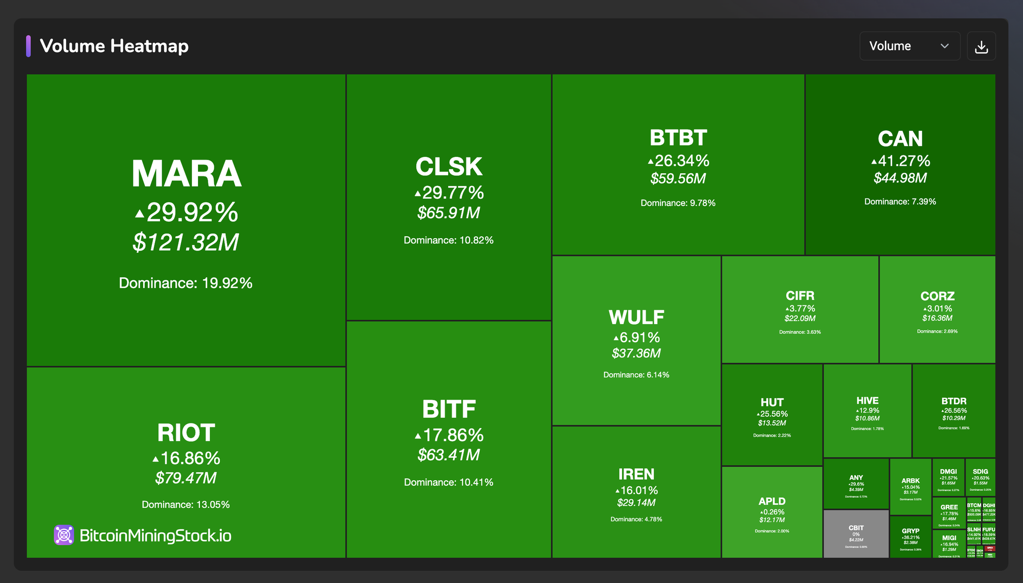
Volume Heatmap
In the previous month we added the Bitcoin Mining Stocks Heatmap. It has since undergone some minor visual improvements, but more importantly, there is now a dropdown menu that lets you switch from a market cap based heatmap to a volume based heatmap. Now you can see which stocks were the most heavily traded in a given day, at a glance.
That's all for this month. We'd love to hear from you if you have any suggestions or feedback about our website. You can use the contact page to get in touch with us or reach out on X. Please also consider subscribing to our newsletter and becoming a paid member to support our ongoing product development. I look forward to updating you all again next month!


